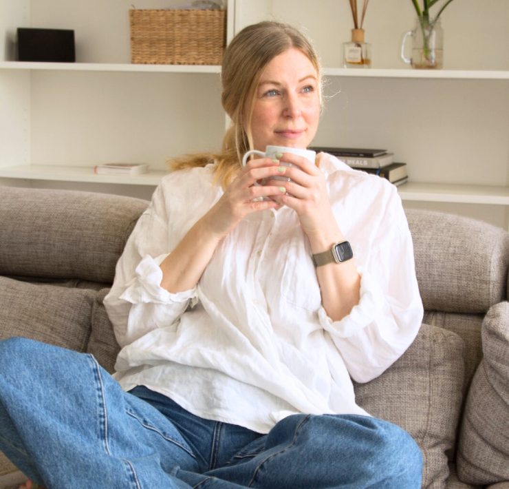
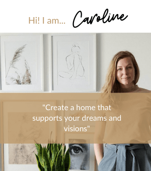
Create a meaningful home with your design story that inspires your life
![]()

![]()

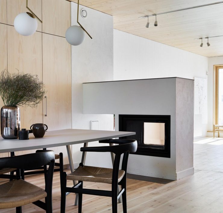
If you wish to juxtapose simplicity and cozyinness in your living room then I have…
If you are over at Pinterest or on Youtube you have probably seen the trending…
For as long as I can remember I have been fascinated by books and especially…
Maximalism Scandinavian design is focused on adding a ‘more’ feeling in your home, than the…
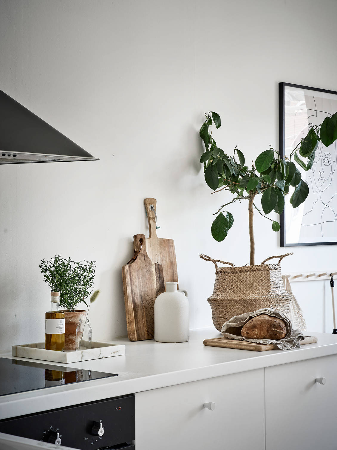
According to interior design trend analysis in 2024 we will see more natural elements within…

")